The New CRN
The New CRN︎
Client ︎︎︎ crn.ngo
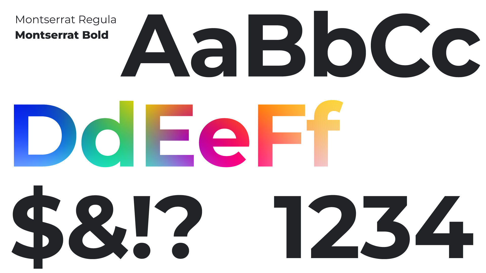
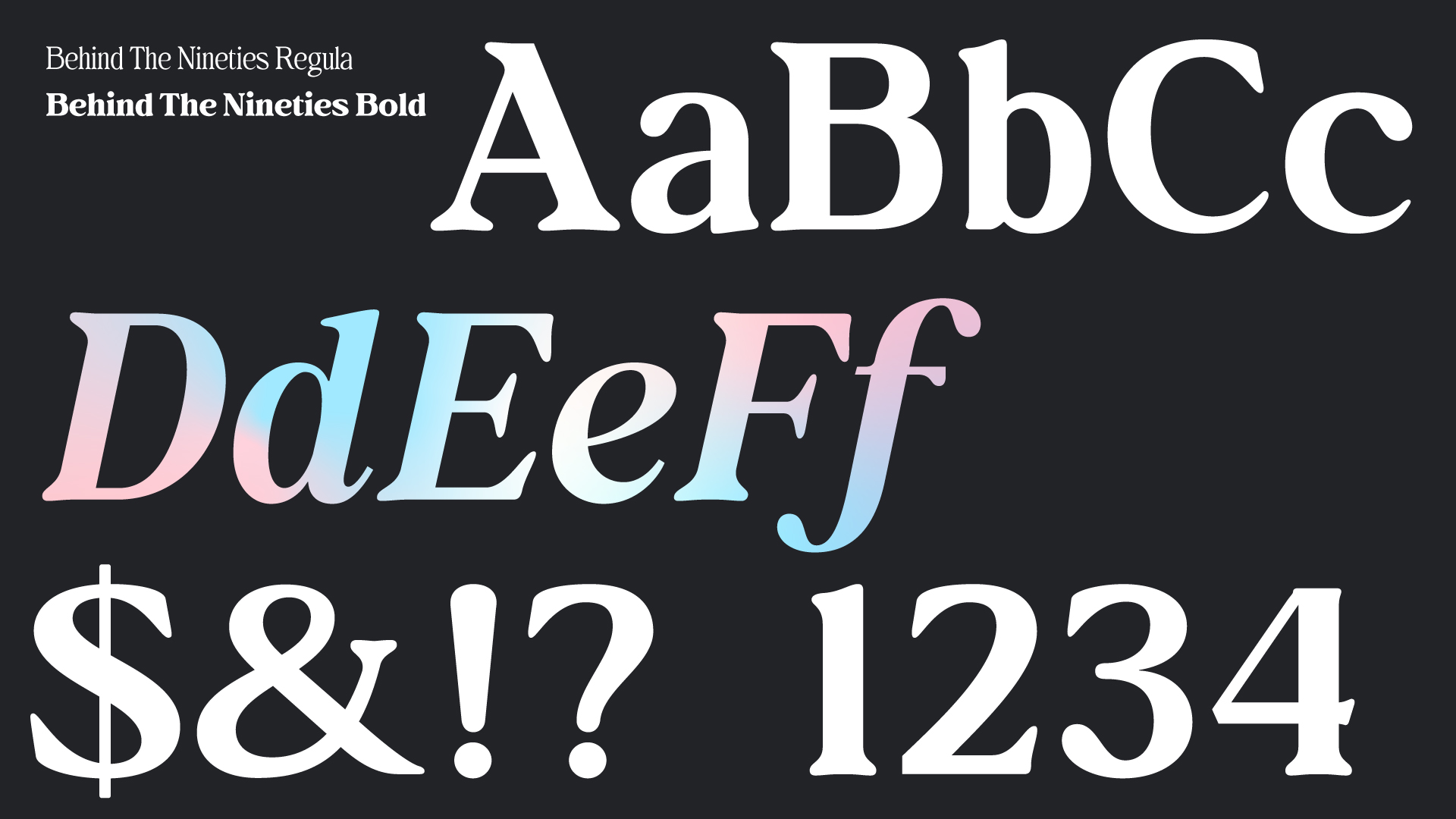
Technique ︎︎︎ logo, font, typography
Dimension ︎︎︎ website PC | Mobile | Video (1920x1080)
Background
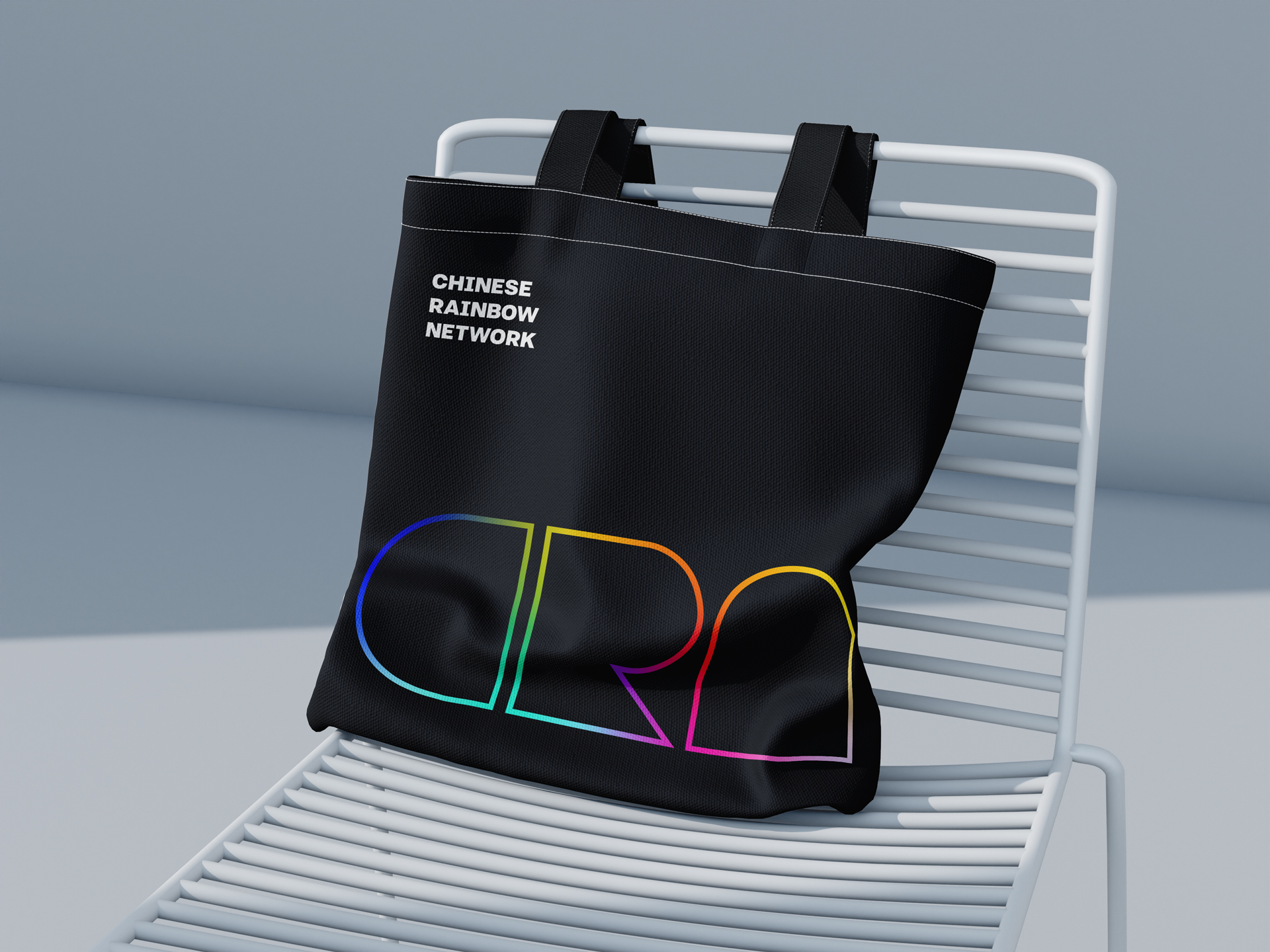
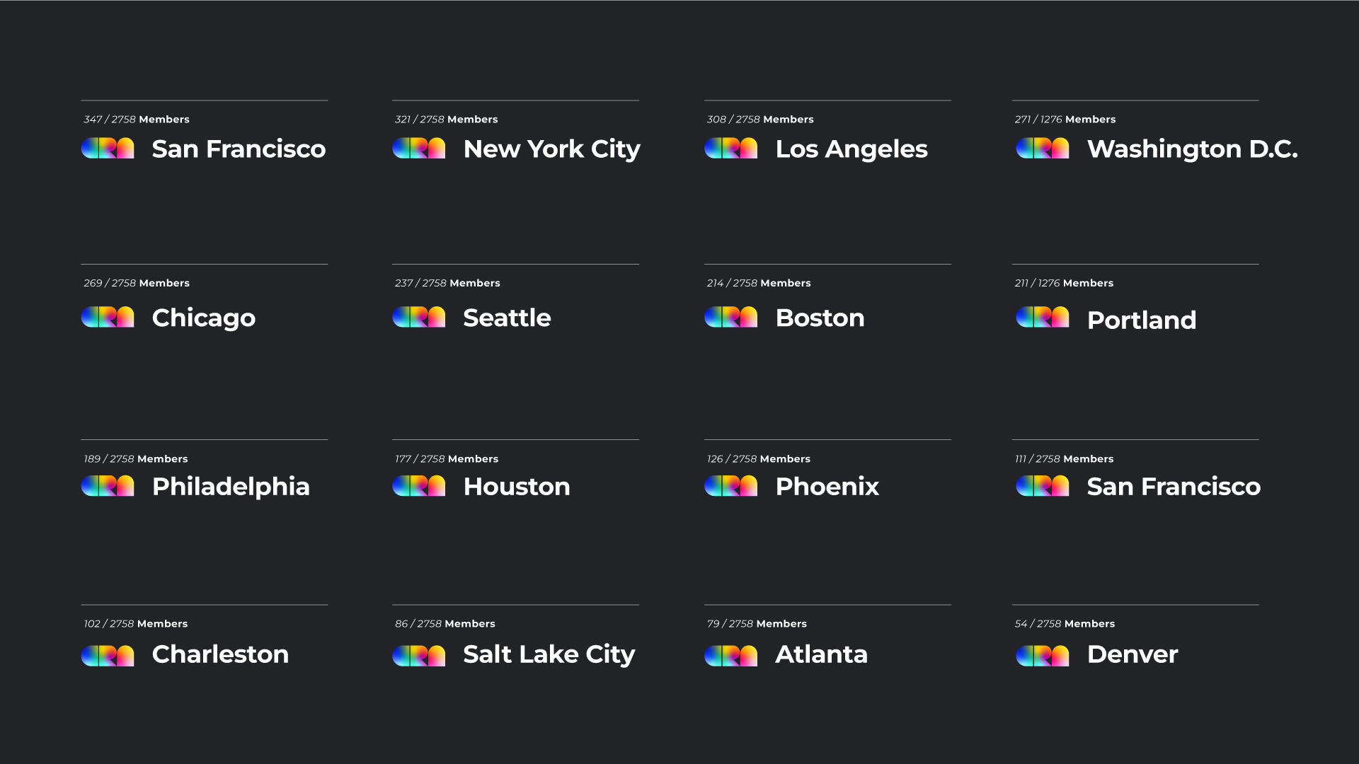
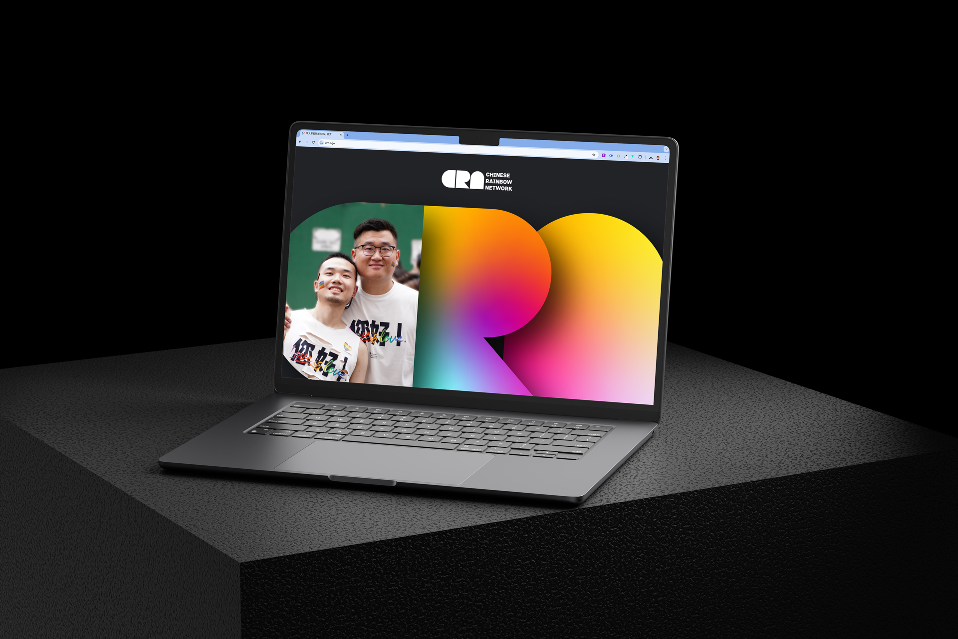
"The New CRN," a non-profit LGBTQ+ organization based in North America and composed of Chinese and Chinese American. CRN's rebrand has taken the organization to a new level.
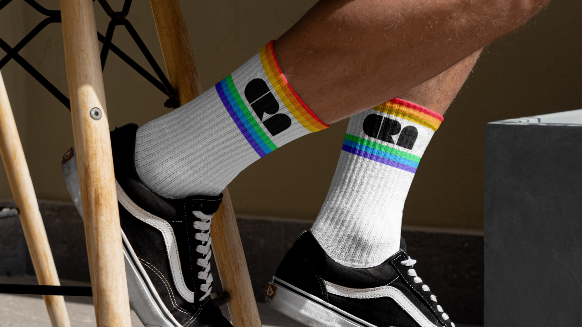
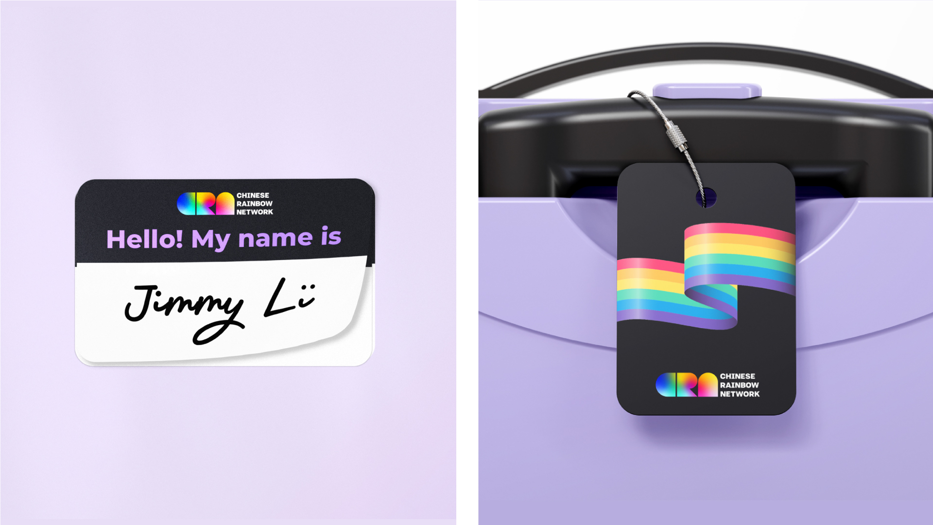
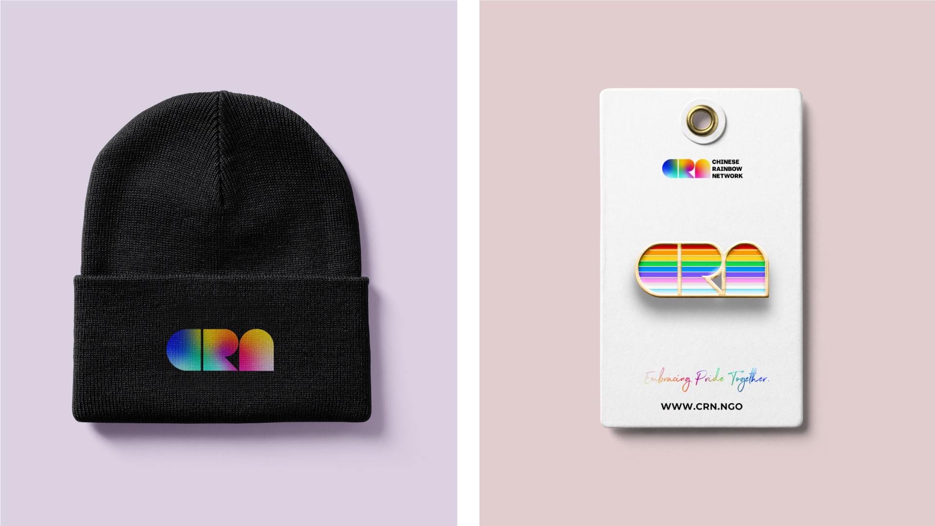
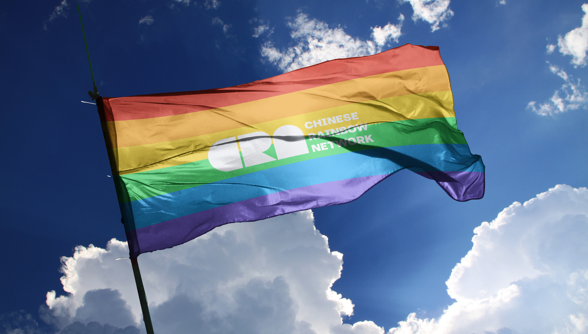
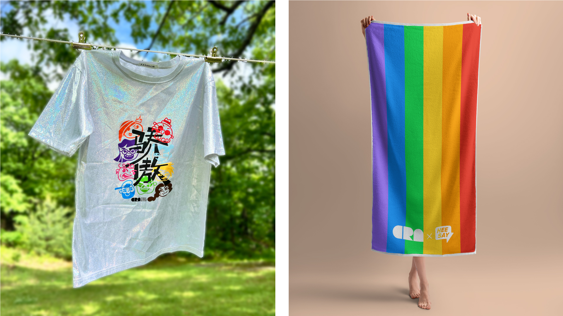
The design inspiration for the CRN logo blends the concepts of "boldness" and "fluidity," using simple geometric shapes to represent the three letters of CRN, creating a clear and impactful visual effect. The rainbow colors gracefully flow through the letters, showcasing diversity and inclusivity—a bright homage that embodies pride and strength. Additionally, the full English name beside the CRN logo enhances recognition, using a modified Helvetica font for a more modern and stable appearance.
Creating a brand that resonates with every member of the community was a challenge, but one we were committed to getting right. The branding redesign emphasizes that CRN is a place where Chinese individuals are welcomed to bring their diverse identities and connect with others. The vibrant visual language, centered around the logo, fully expresses the unique identity of the Chinese LGBTQ+ community.
CRN's new identity is not just a visual transformation; it is also a symbol of our community's unity and diversity. We hope that the new logo and related products will inspire everyone to bravely express their true selves and embrace diversity and inclusion. We look forward to your continued support as we walk together with love, building a brighter future!