Norwegian Air Shuttle

NORWEGIAN ︎
Taking Norwegian Air Shuttle to New Heights
Client ︎︎︎ Norwegian Air Shuttle
Technique ︎︎︎ Inkjet print
Dimension ︎︎︎ 8x10.5 inch
Objective
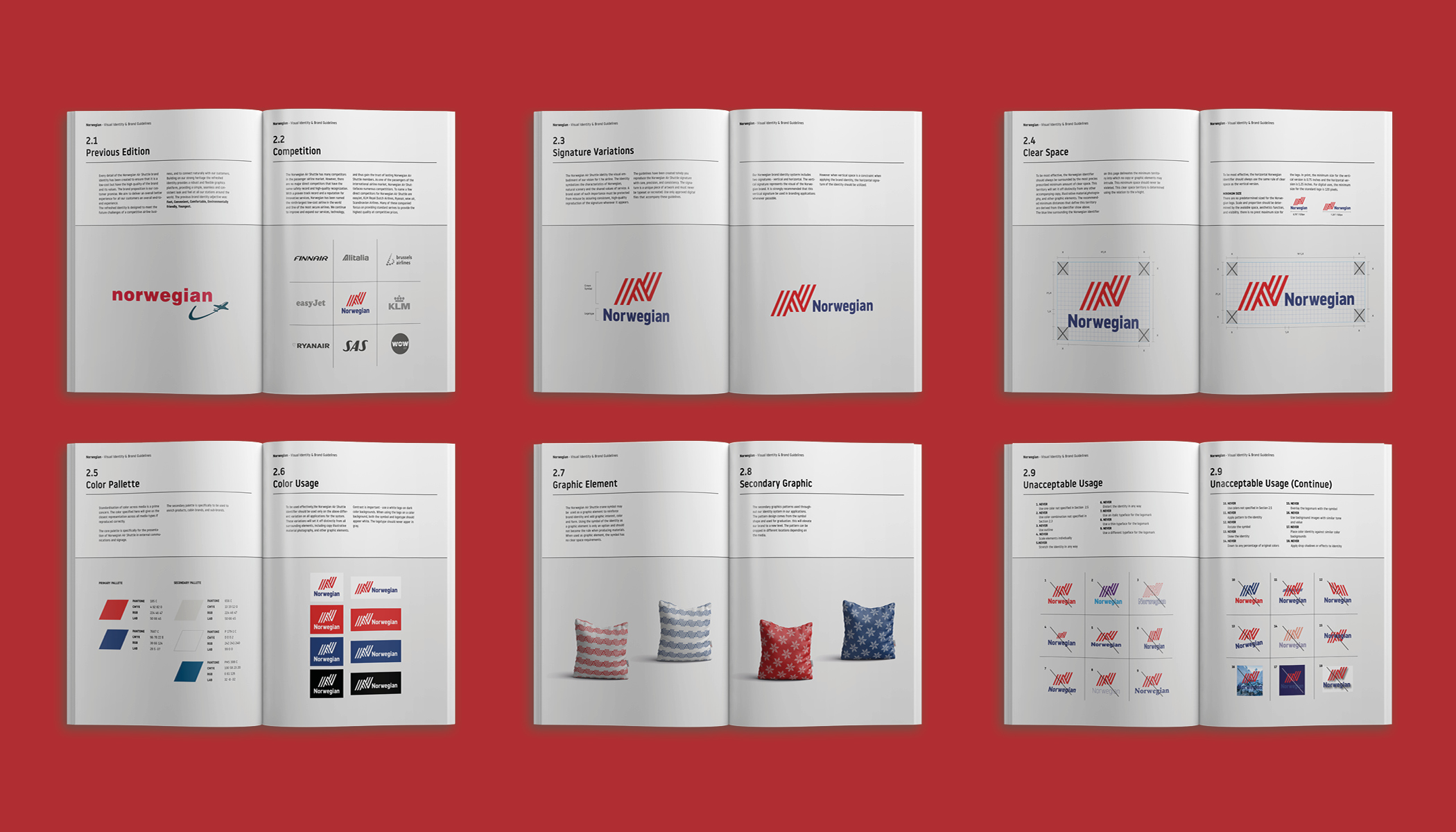
To create a corporate identity redesign for an airline and an applications and stationery system and a graphics standards manual.
Solution
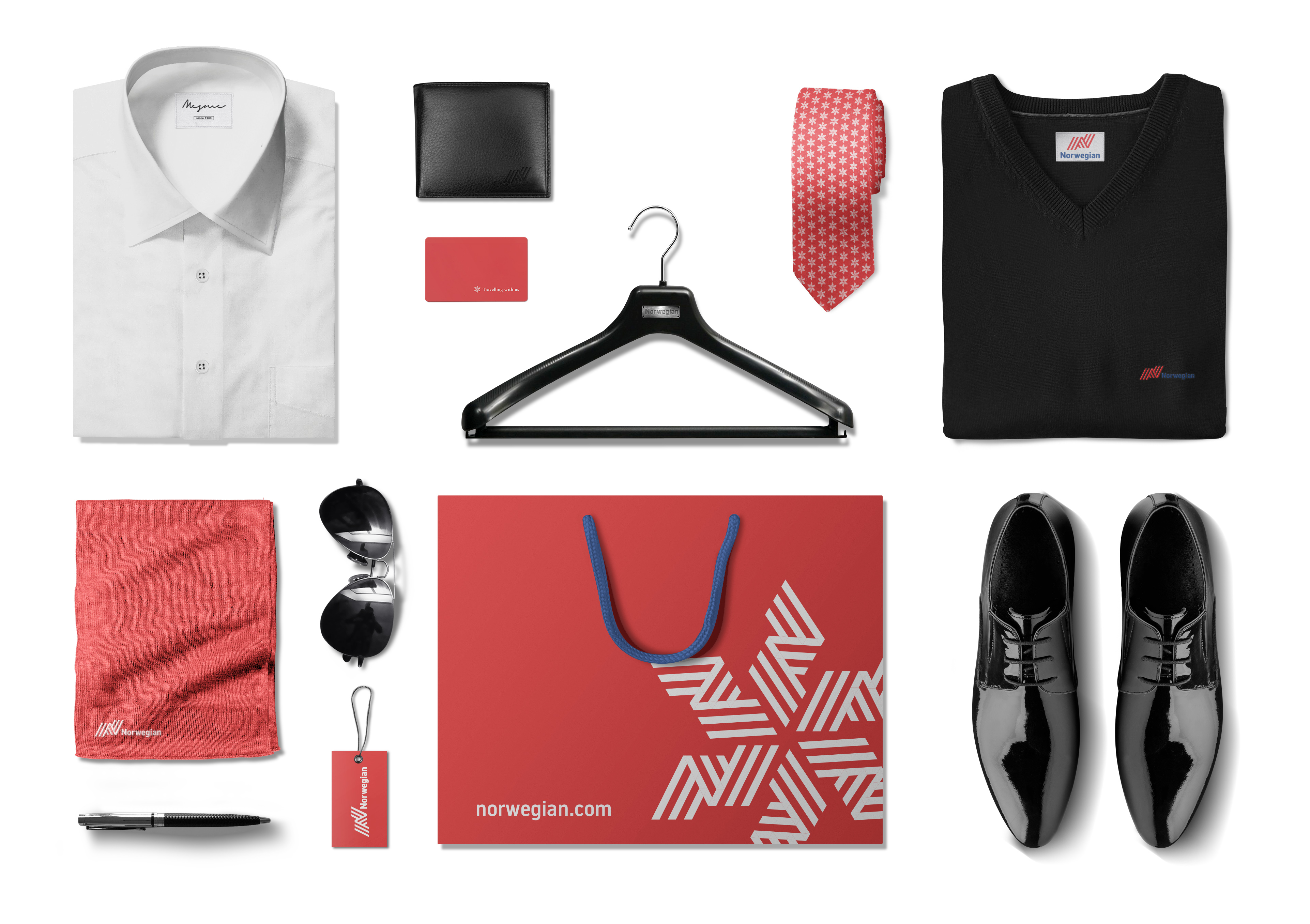
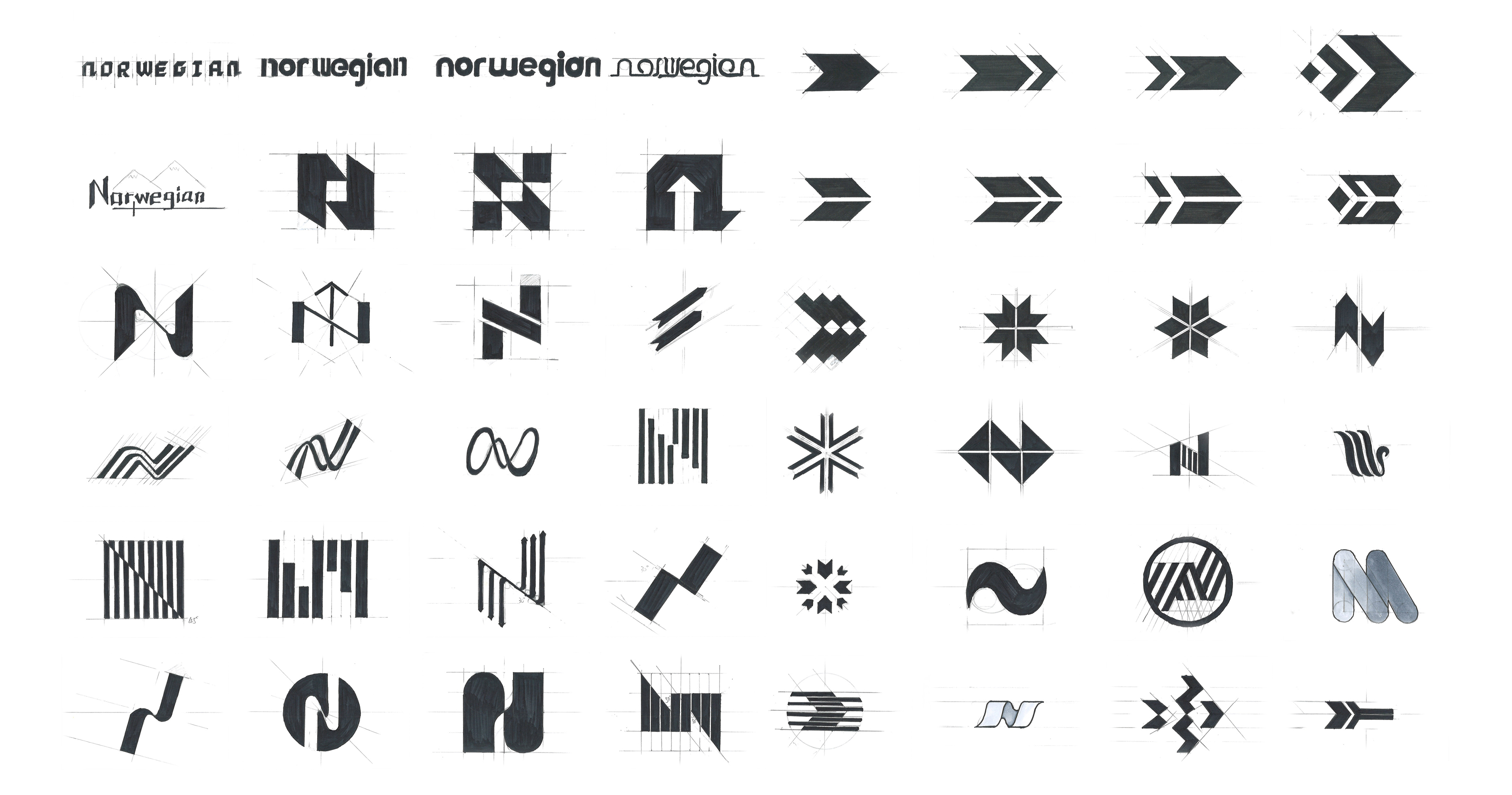
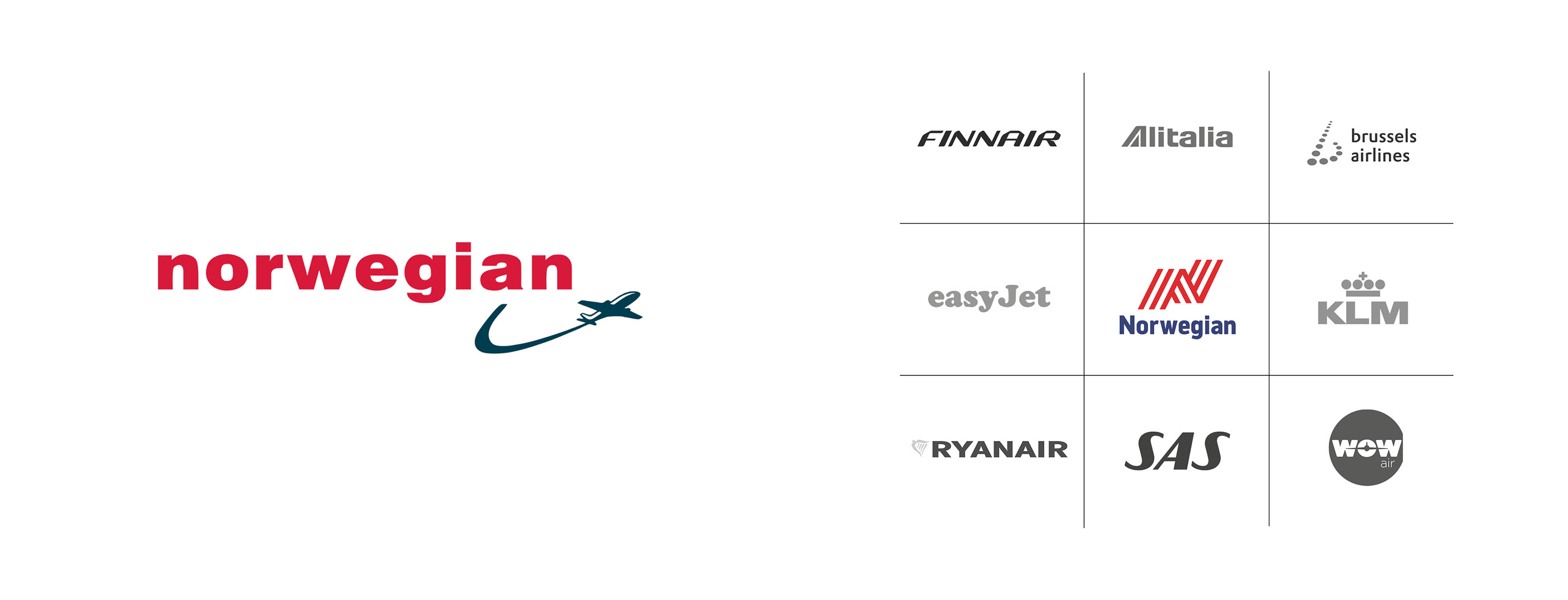
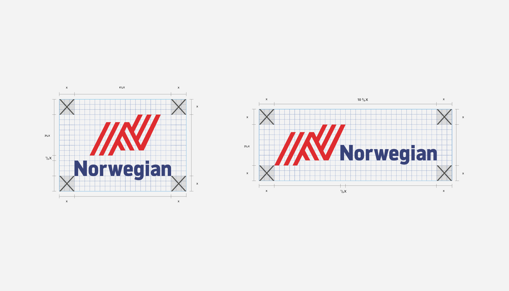
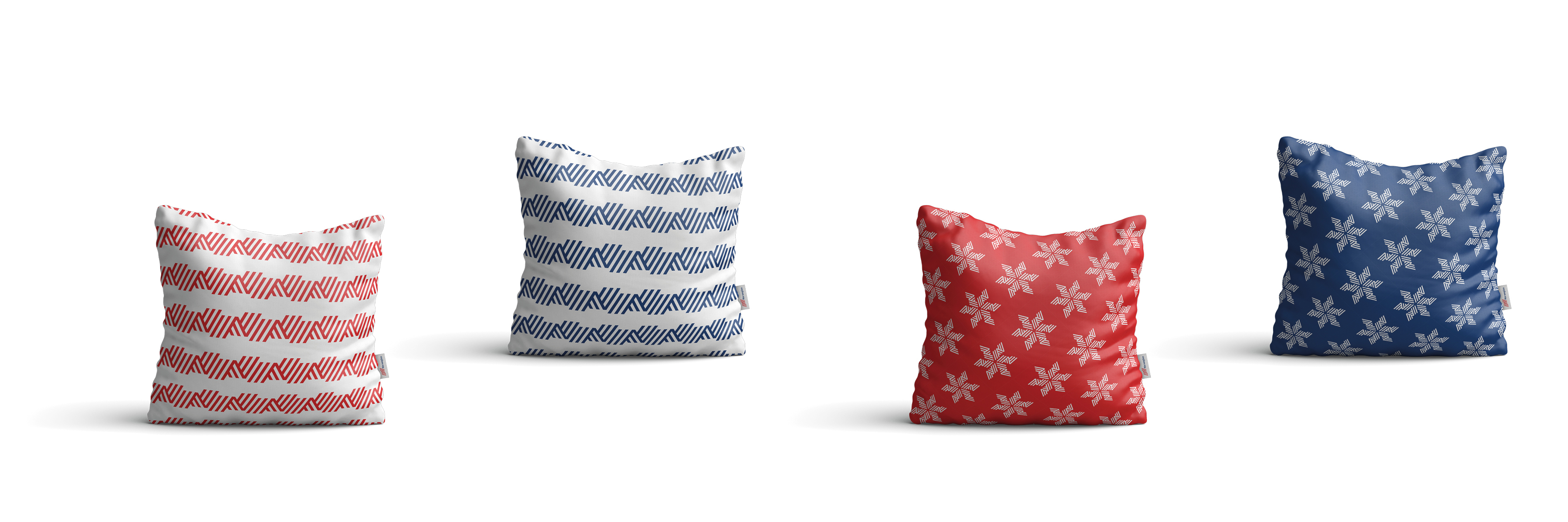
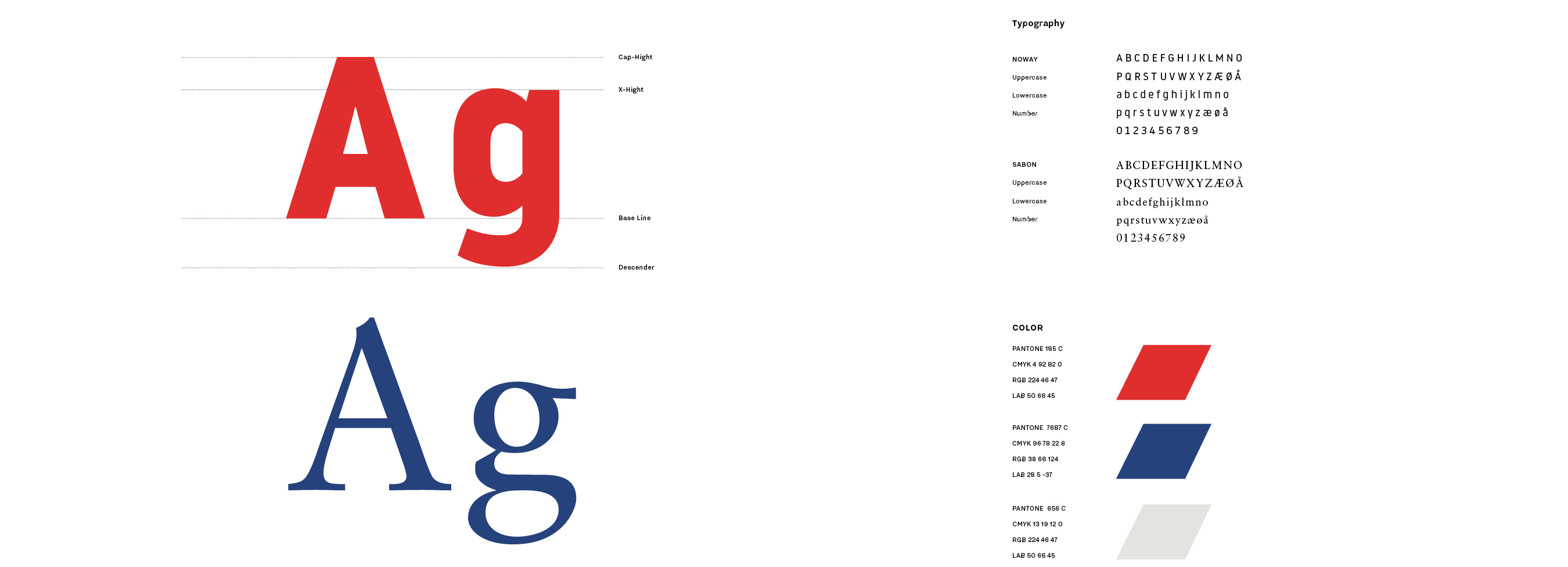
I chose the Norwegian Air Shuttle. Norwegian is a low-cost, but high-quality international airline. I think it would be a good idea to revamp their brand into one that is more international and more concise. The first step was to redesign the Norwegian Air Shuttle logo. Then, I created a new brand identity. I made the brand more unique and with a minimal design that would stand out.

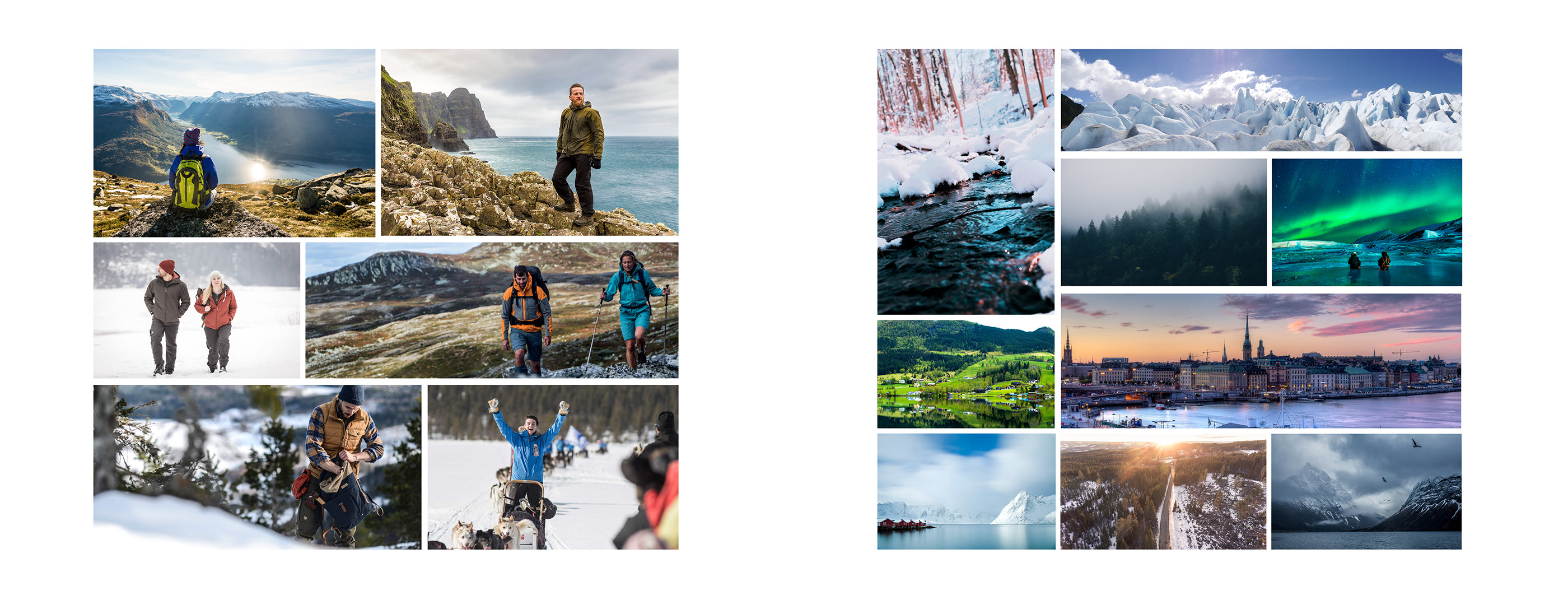
Photography Portrait & Natural and Scenery
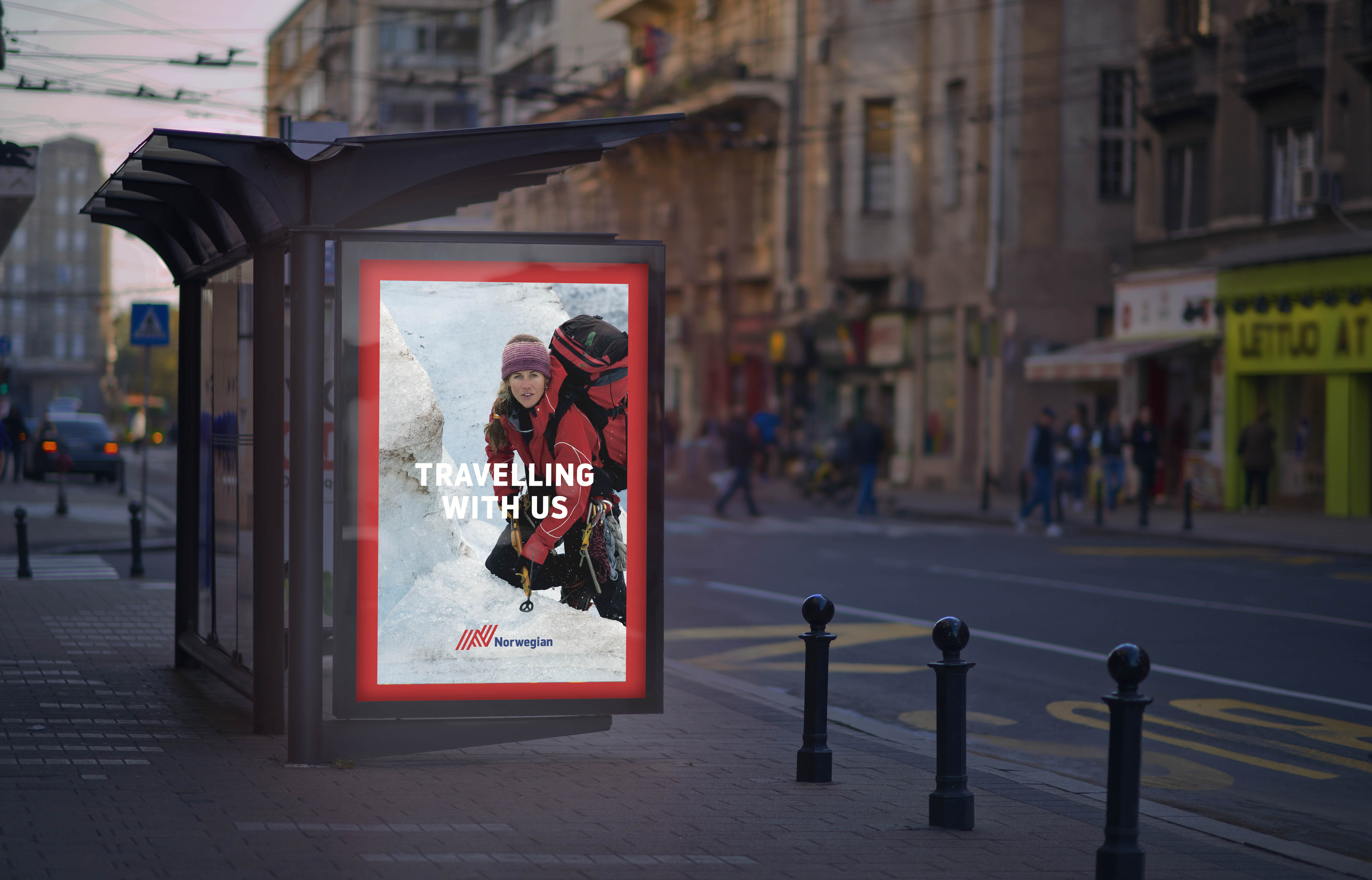
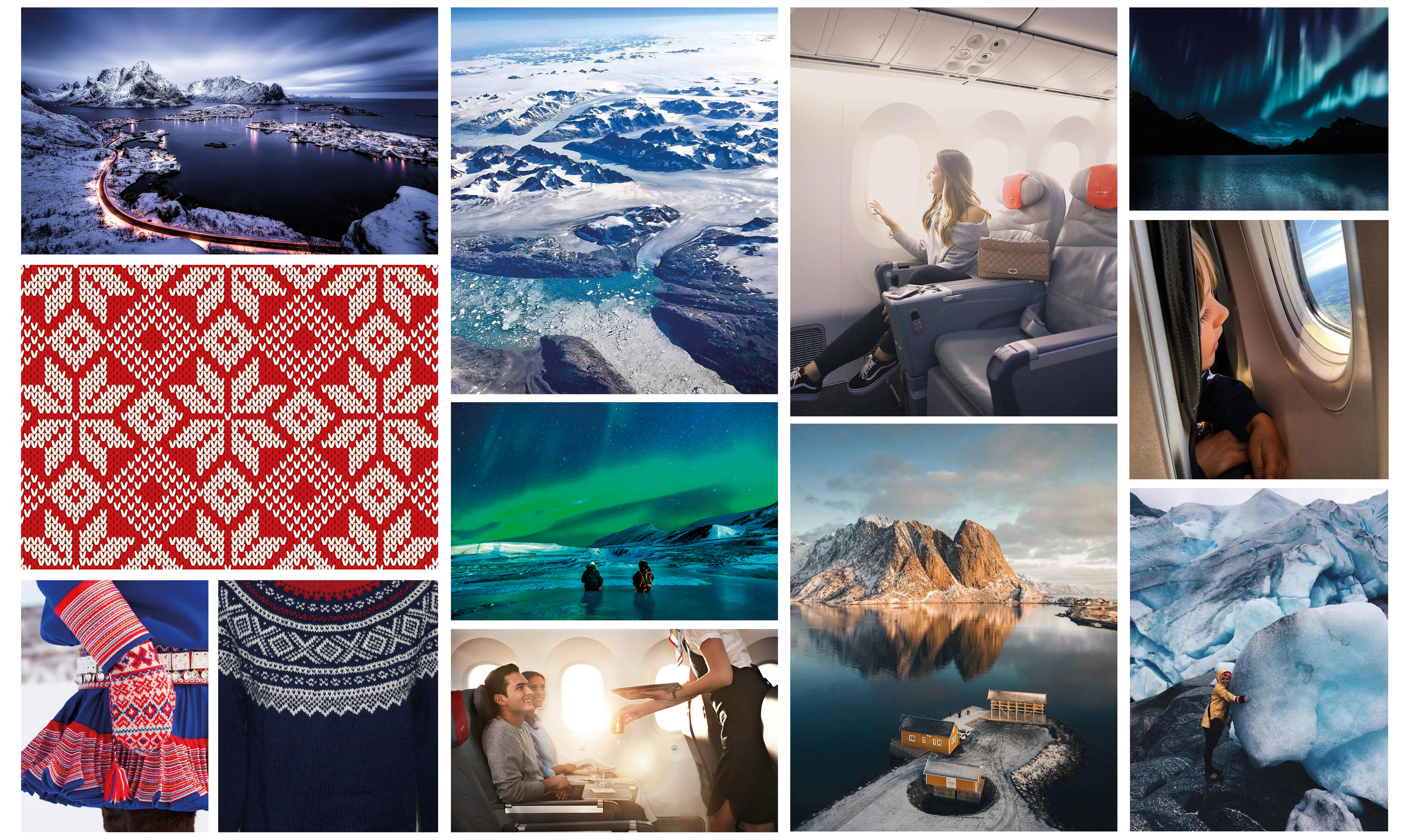
Portraiture possesses an intimate quality. Whether portraitures or photo-journalistic shots of people, there is a striking trait they share in common. Each embodies the person/ people depicted and express genuine emotion. The portrait photography used should be direct and powerful. It should create a connection to the subject matter and be strong enough to stand alone. Norwegian Air Shuttle identified and focused on a new target group, the Norwegian frequent travelers. We named our new target group “The True Travelers”. The new image style is inspired by the true traveler’s view of the world. The magic and beauty of Scandinavia will take your breath away! Norway, Finland, Iceland, and Sweden are all home to some of the most breathtaking natural scenery in the world. Each country has its own unique way of delivering that ‘wow’ factor you’re looking for Iceland’s Blue Lagoon, The Northern Lights in Finland, Sweden’s Stockholm Archipelago, The Majestic Fjord Region in Norway, and Norway’s Waterfalls.
![]()
Stationery System
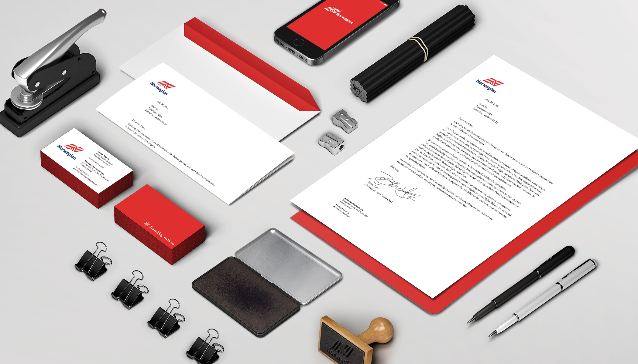
The complete stationery system consists of business cards, letterhead no.10 envelopes, and crack & peel mailing labels. This system has been designed to convey a clean and professional look.
