Info  PDF Portfolio

Chen (Andrew) Xu ︎︎︎


Commercial Projects

EXHIBITION

2013-2023


  1. Cocreate x EPE
  2. Hello! Love is love.
  3. Elite Top 10 Industries Ads
  4. BY&S
  5. Let’s Think About Home
  6. Elite Promotional Event
  7. Masslottery 50th Year Anniversary
  8. HiLink Platform
  9. HiLink Education Web design 
  10. Be Someone’s Home
  11. The One
  12. Hi Hot Pot
  13. RICEPO
  14. CRN Annual Gala 2019
  15. 3L Boxed Wine
  16. Taste is King


Poster

EXHIBITION


AIGC

EXHIBITION


Digital Art & Motion Graphic

EXHIBITION


School Projects

EXHIBITION
2015-2019

  1. Art and Form
  2. Online Clinic App
  3. Sustainable Paint Package
  4. Fika
  5. Norwegian
  6. The Book Of The Tea World
  7. Code
  8. O&M Grocery Market
  9. Swedish


Info

I am a multidisciplinary designer based in Malden, Massachusetts, specializing in visual identity, art direction, print and digital experience. My hope is to seamlessly integrate research, typography, branding, and packaging that will be used in business and design art. Currently I learning AI to generate content and applying this technology to Alibaba.com EPE visual design.


Creative Designer at  Alibaba.com


Mark

O&M Grocery Market


O&M GROCERY MARKET ︎
Best Shopping Experience
Client ︎︎︎ School Project
Technique ︎︎︎ Branding | Package
Dimension ︎︎︎ Inkjet print | Digital print | Rub down dry transfers

           
Objective

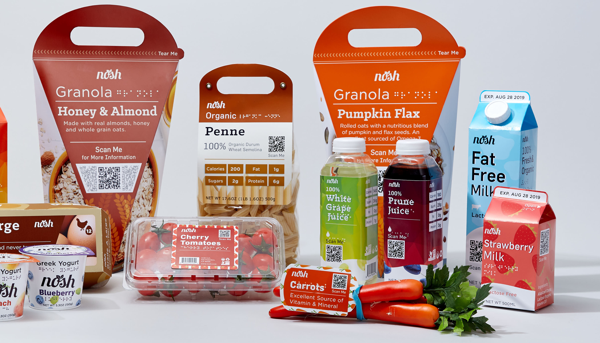
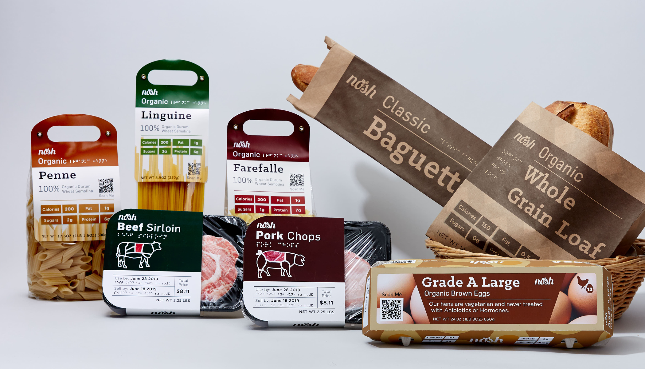
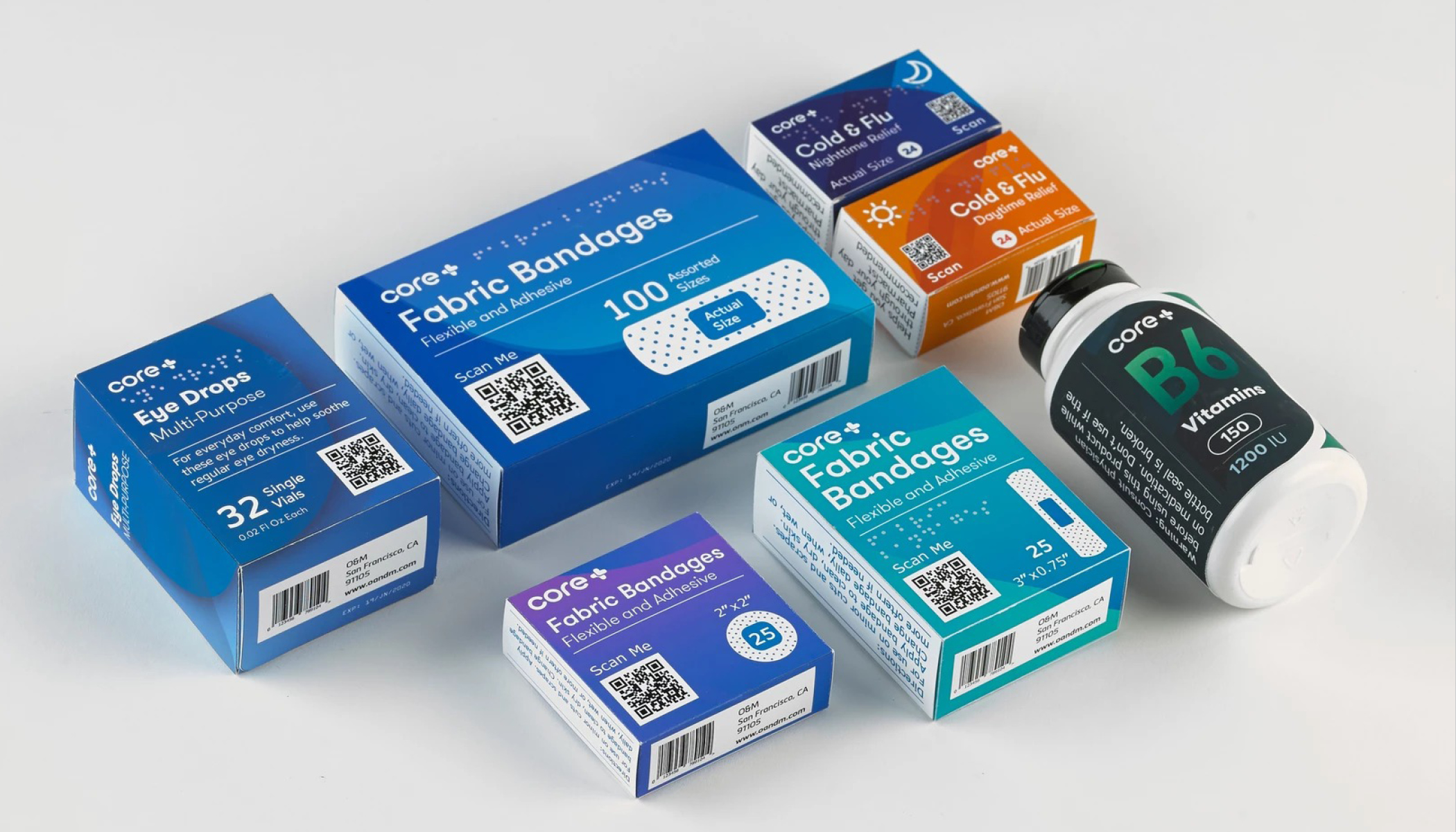
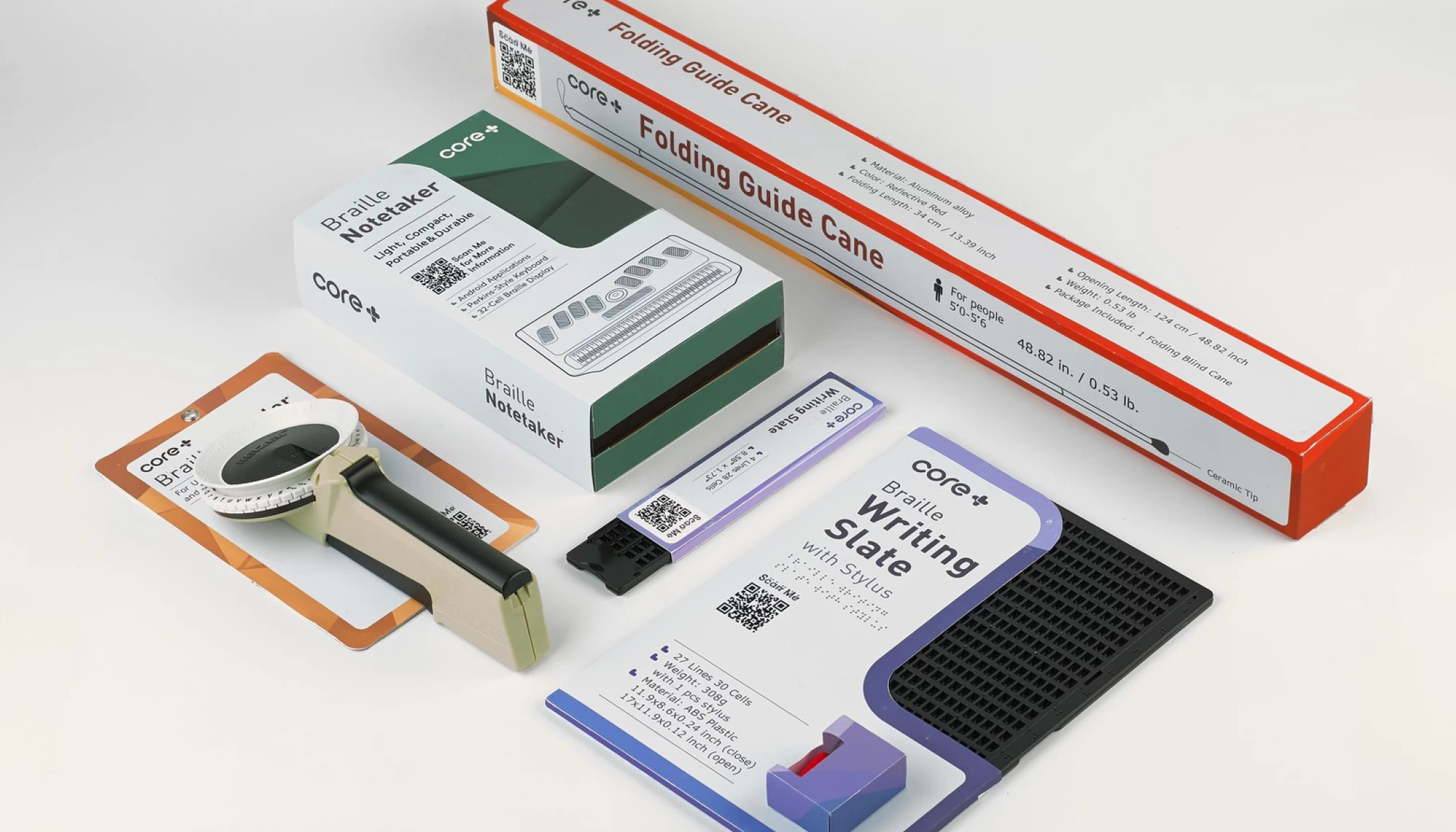
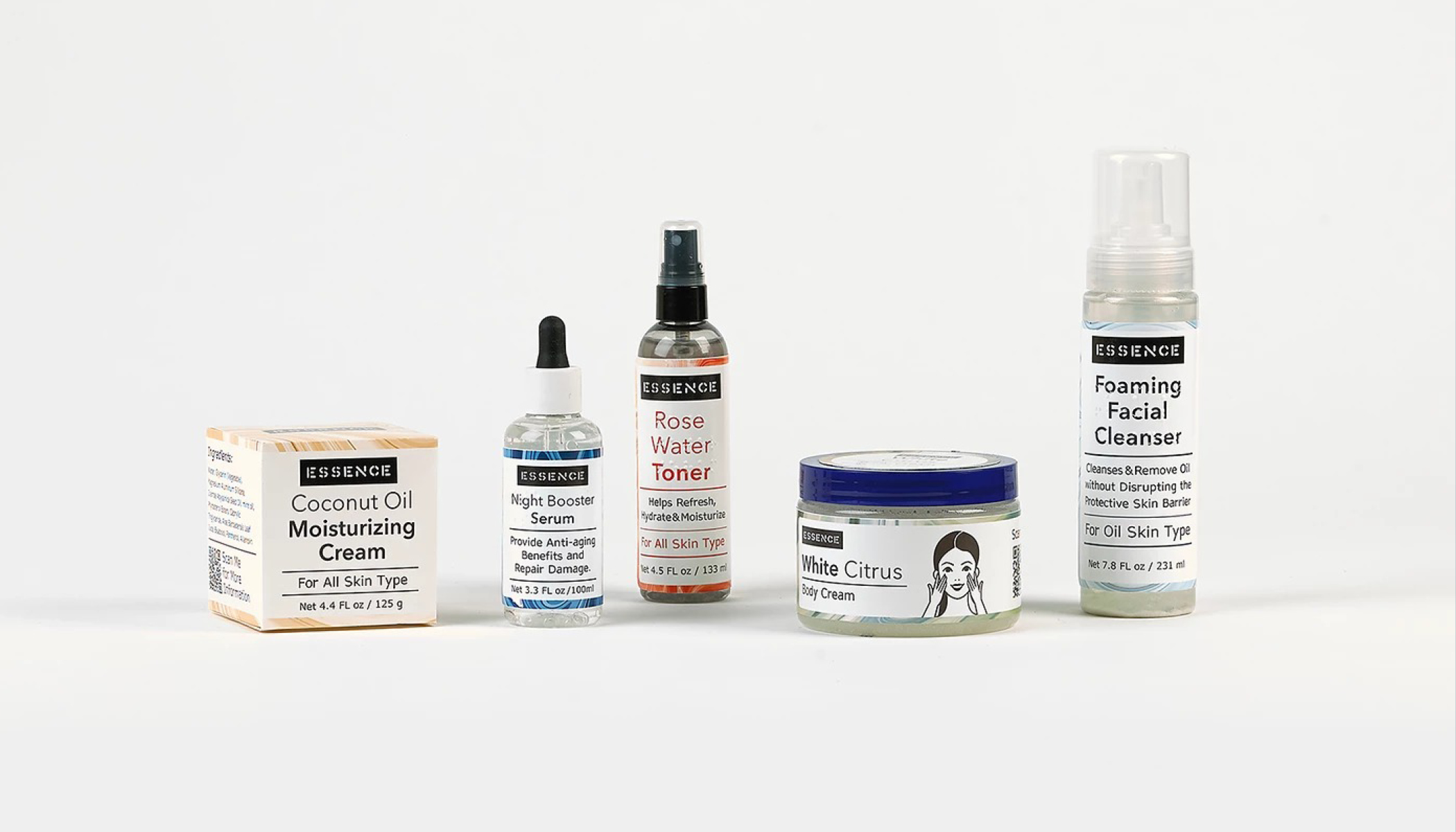
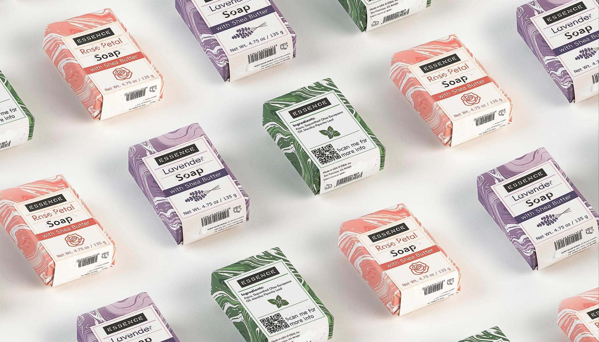
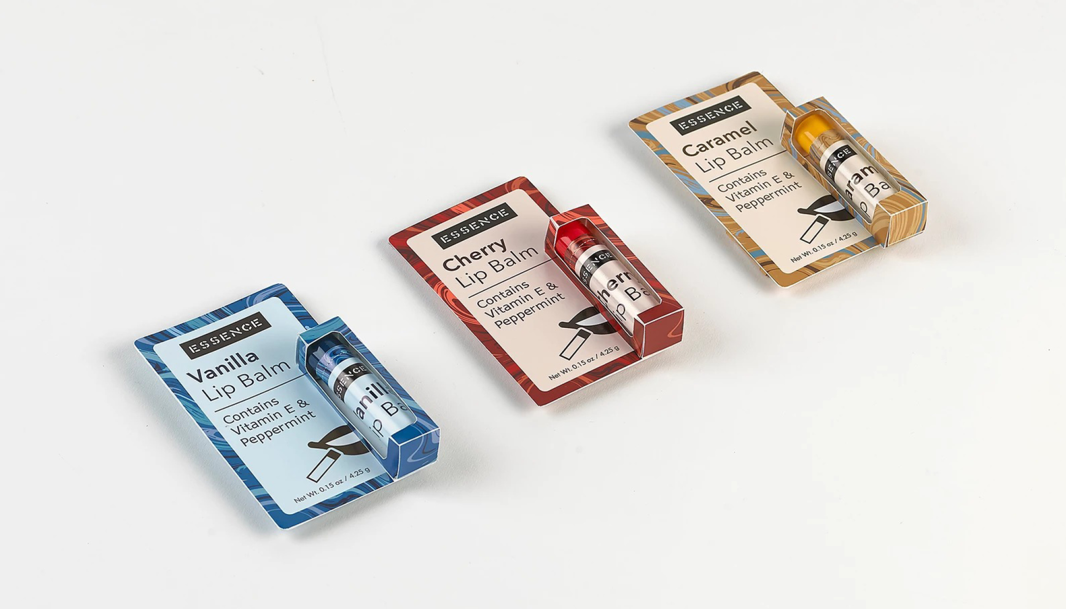
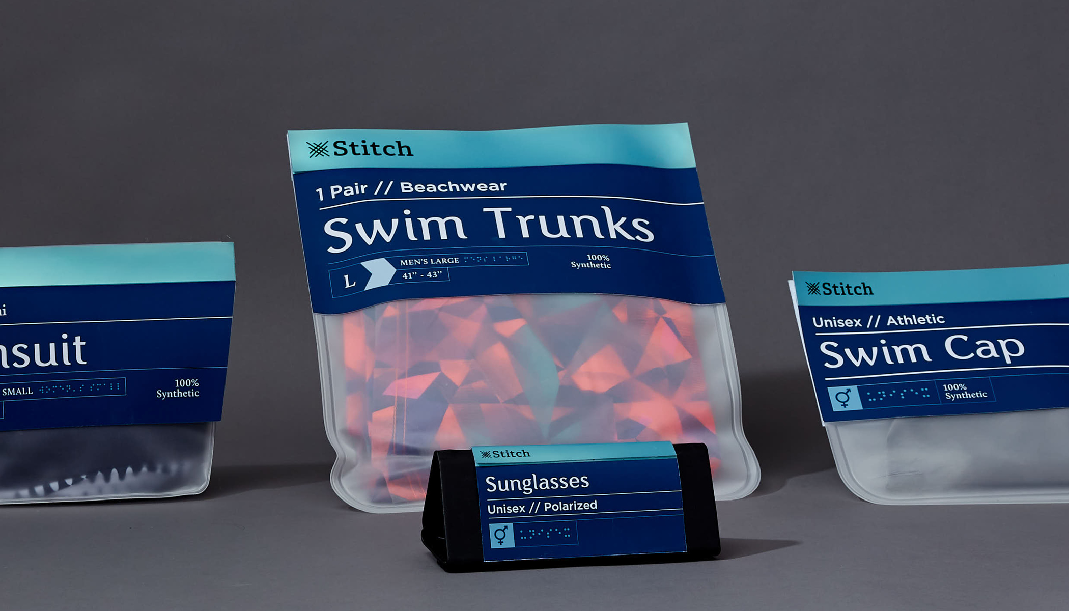
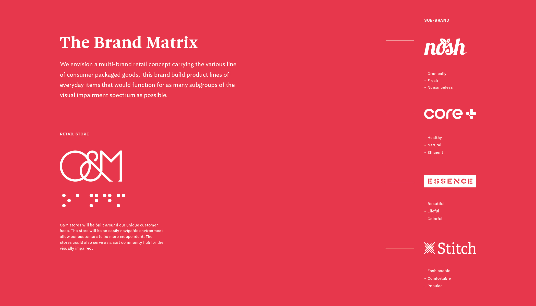
Create a series of products that cover everyday shopping needs, and are accessible and useable for blind and visually impaired people.

Solution

O&M establishes four lines of products to help visually impaired people. The whole product line is divided into four lines, Nosh for food, core+ for medication, Essence for beauty, and Stitch for clothing. We developed three personas, one representing each of the groups, and used them in combination with government and advocacy group guidelines to design our packaging. One of the functions is colors to help impaired customers differentiate similar products. The clean typeface is used to increase the legibility of the content and avoid any unnecessary, minimum legible font size is 16pt or 18pt. And we used the QR code on each package for listening to the audio. The overall packaging design is minimal yet efficient. It maintains an accessible visual appearance while being practical and inviting.


Mark